

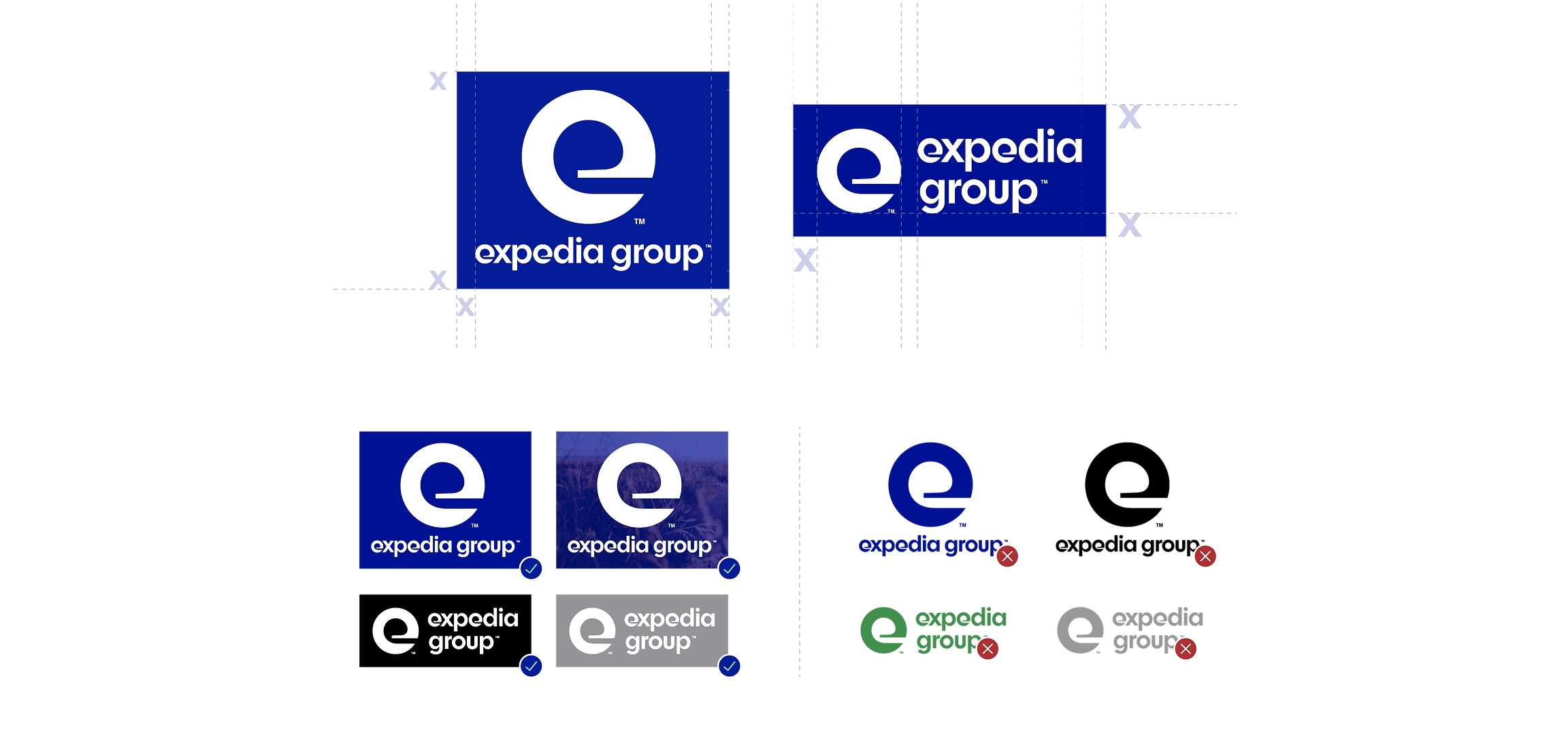
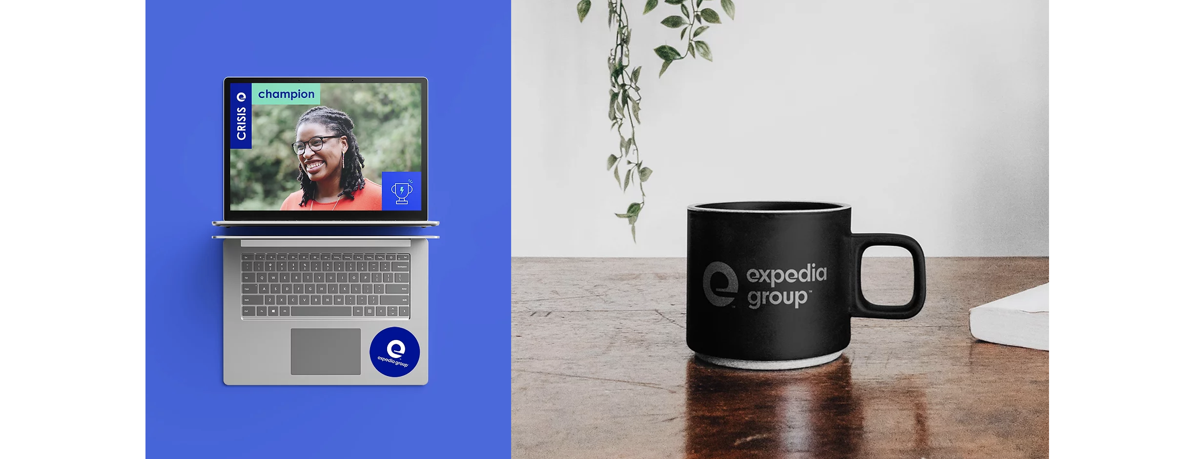
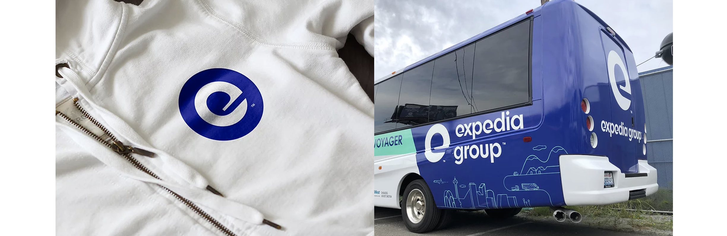

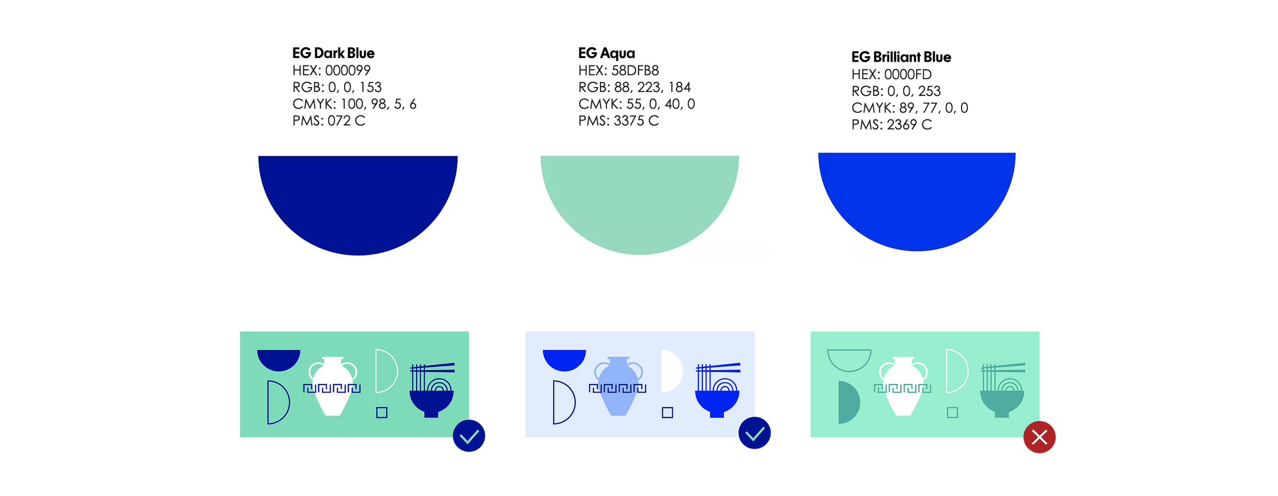
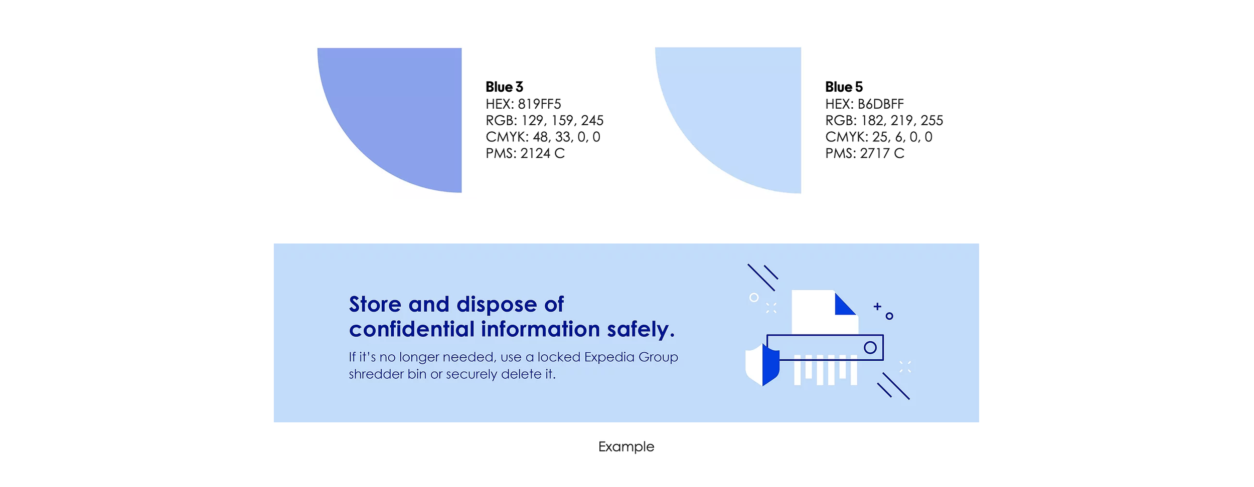

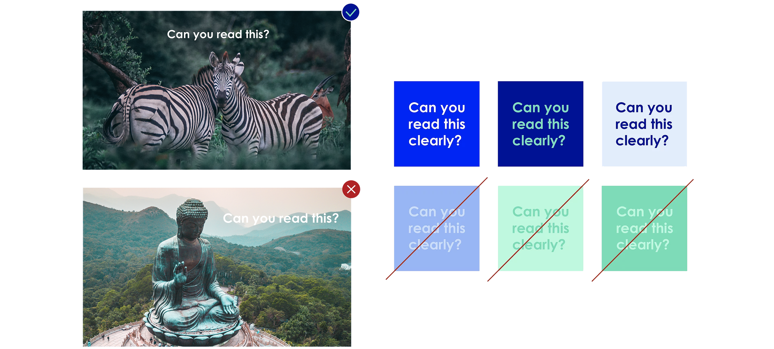

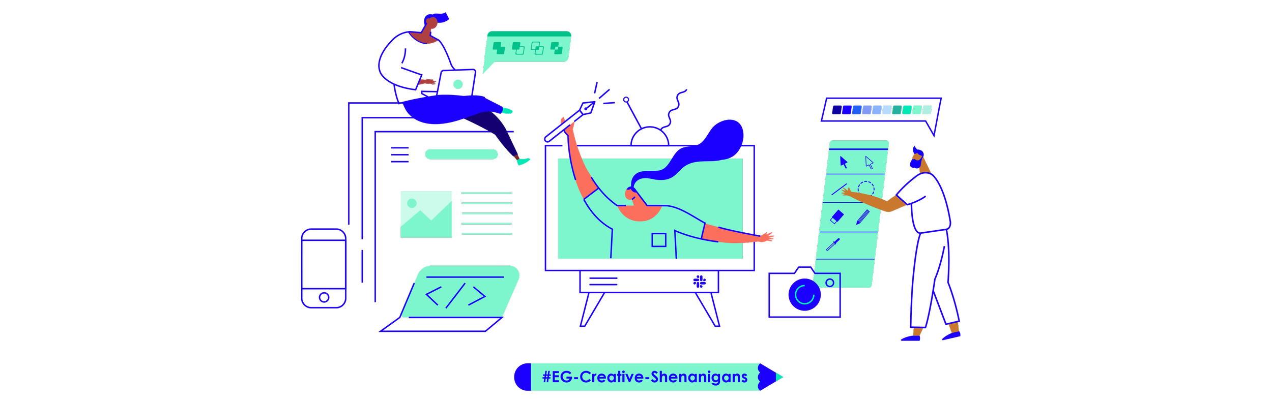

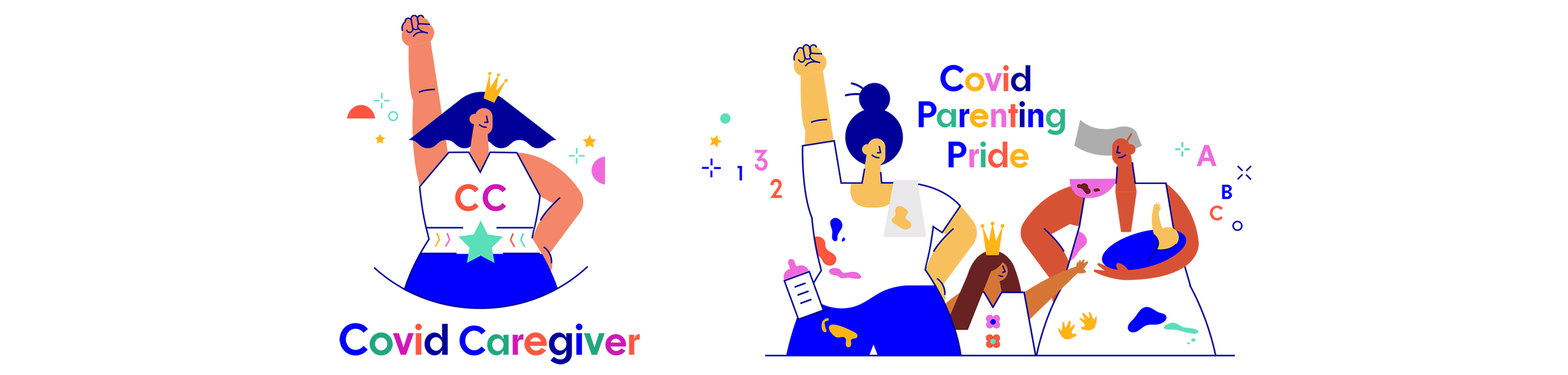
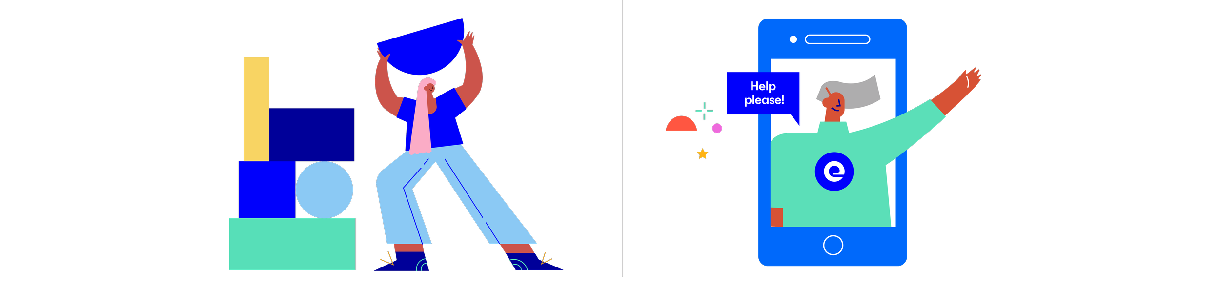
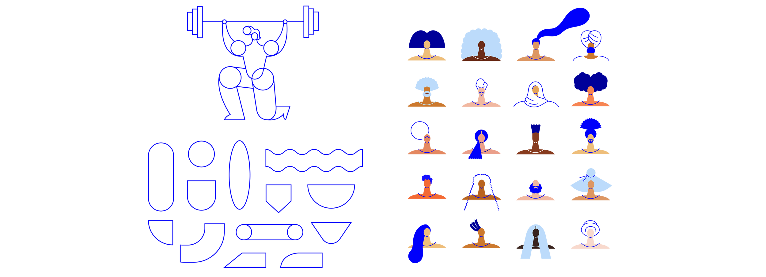

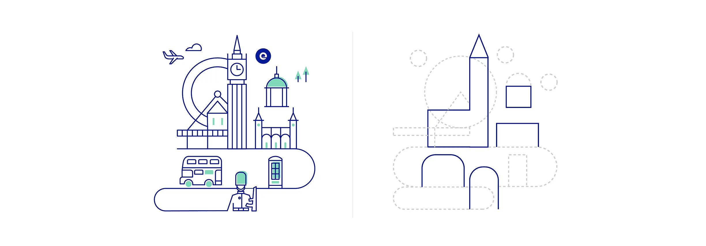
When I joined the Comms and Corporate Brand team in 2019, I learned that the EG brand identity toolkit was sparse - we had a logo, some fonts, and a few shades of blue to work with but the rest was up to us to figure out. This was the largest project that I undertook at EG, as we were essentially building a corporate brand identity and toolkit for all of our employees and even external partners; our team was building the cart as we were riding the ponies, so to speak.
What did this project entail? First I spent about a year actually creating assets like icons, illustrations, banners, etc. in order to have a repository of examples. Then I spent about 3 months planning and designing a site - the online Brand Guide - with enormous help from our external creative agency Aquent (Nathanel Clanton) and art direction from Kristen Barcheski. This site houses all of our brand assets, templates and guides so anyone at EG can download what they need to do their job. We accomplished our goal of creating a consistent and robust corporate brand identity that could be scaled for both internal and external audiences.
Art direction and strategy: Kristen Barcheski / Site layout and design: Nathanael Clayton and Stephanie Elliott / Brand Director: Gillian O’Connell
When I joined the Comms and Corporate Brand team in 2019, I learned that the EG brand identity toolkit was sparse - we had a logo, some fonts, and a few shades of blue to work with but the rest was up to us to figure out. This was the largest project that I undertook at EG, as we were essentially building a corporate brand identity and toolkit for all of our employees and even external partners; our team was building the cart as we were riding the ponies, so to speak.
I spent about a year actually creating assets like icons, illustrations, banners, etc. in order to have a repository of examples. Then I spent 3 months planning and designing a site - the online Brand Guide - with enormous help from our external creative agency Aquent (Nathanel Clanton) and art direction from Kristen Barcheski. This site houses all of our brand assets, templates and guides so anyone at EG can download what they need to do their job. We accomplished our goal of creating a consistent and robust corporate brand identity that could be scaled for both internal and external audiences.
Art direction and strategy: Kristen Barcheski / Site layout and design: Nathanael Clayton and Stephanie Elliott / Brand Director: Gillian O’Connell